Think your ads are cutting it? Without creative testing on Meta, you could be flying blind.
Table of Contents
I’ve witnessed firsthand the transformation of ads developing from being static images with 80% text, to now, being dynamic, ever-evolving and focusing a lot more on leveraging UGC for unique and authentic content.
In this piece, I’ll be sharing insights that are not just derived from my experiences but also from how we work as an agency, with a proactive stance on leveraging Meta’s creative testing tools to beat the competition.
The important role of being scientific in your creative testing approach on Meta (and Paid Social in general)
Let’s begin with getting the fundamentals right.
At the heart of effective creative testing lies the application of a rigorous, scientific methodology. We all know the saying – “You cannot compare apples and oranges”, right?
Like all good tests, scientific methodology should be implemented. This will minimize the influence of bias or prejudice on the experimenter, while providing a standardized approach to conducting experiments and in doing so, achieving reliable results.
The process starts with identifying your core business objective that your creative aims to address—be it driving app installs through gameplay visuals versus CGI, or engaging users with immersive video content. From this foundation, you should then formulate a hypothesis, such as the proposition that gameplay creatives outperform live-action in terms of cost per install.
Here’s an example of a hypothesis in this scenario:
Gameplay-focused creative content will yield a lower cost per install compared to live-action creative content for mobile apps, due to higher engagement and relevance to the target audience.
Why do you need a hypothesis to test creatives on Meta?
Working with a hypothesis is crucial because it gives your tests a clear direction and purpose. It allows you to make precise predictions about the outcomes you expect to see.
By validating or disproving your hypothesis, you can systematically uncover what strategies or creative elements work best for your objectives.
This approach ensures that your decisions are informed and based on data, helping you to optimize your efforts and achieve better results more efficiently. Let’s dive a little deeper into why you NEED to have a scientific approach to creative testing.
What happens if you don’t have a scientific approach to creative testing?
Failing to use scientific methodology in creative testing and campaign management can have several adverse effects on you and your experiments:
![]() Increased bias:
Increased bias:
Leads to skewed selection and interpretation of campaign data, potentially misleading strategy.
 Unreliable data:
Without controlled testing, data may be influenced by external factors, making your insights more inaccurate. Remember, the structure of your testing highly depends on the hypothesis you have.
![]() Inefficient budget use:
Inefficient budget use:
Misinterpretation of data can result in poor budget allocation, driving up acquisition costs and reducing your return.
 Scaling challenges:
Difficulty identifying what works hampers effective campaign scaling, potentially limiting your growth.
 Lost competitive edge:
A non-methodical approach may leave your campaigns outdated, diminishing your brand’s market position.
 Weakened long-term strategy:
Cumulative inefficiencies can degrade your overall business performance and strategy resilience.
In essence, the absence of a scientific approach can lead to misinformed decisions, wasted resources, and diminished campaign effectiveness.
Designing effective creative tests on Meta
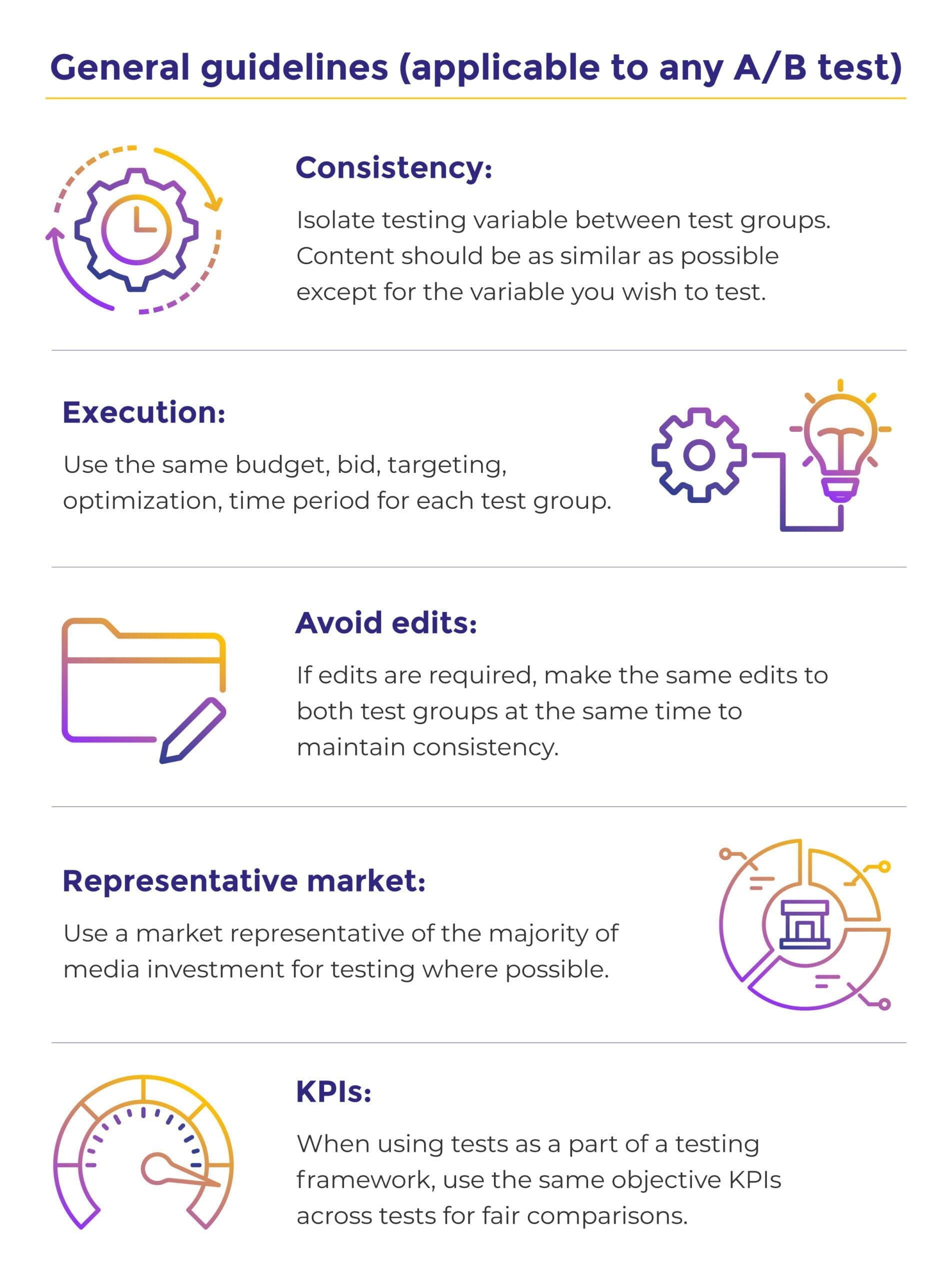
The design of your test is crucial for you. Your goal is to accurately reflect your usual market environment in a way that’s both cost-effective and practical, striking a balance between the reliability of the test and any limitations you might face.
This means you’ll need to make informed decisions about how broad or narrow your test should be and how it will be carried out, decisions that will directly impact how valid and scalable your results are. You need to understand the trade-offs involved, including considerations of cost, time, and the reliability of your findings during this phase.
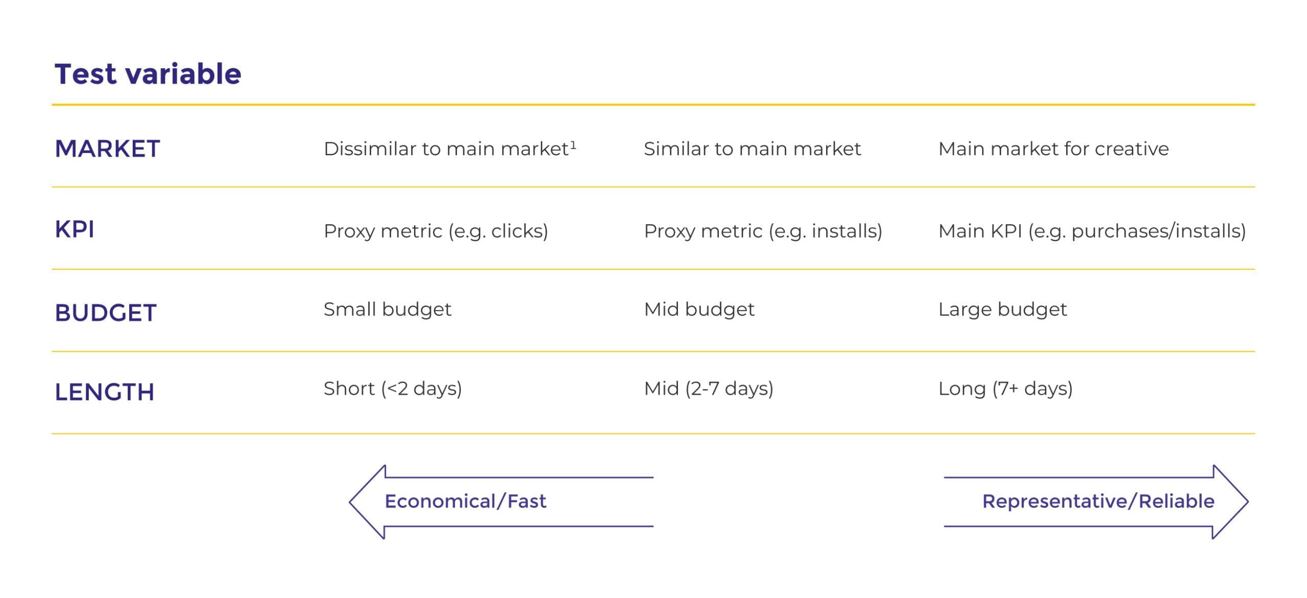
Our general guidelines for A/B testing
I often speak with other professional marketers and A/B tests are something that’s always up for talks. To make it simple for you, we’ve built our very own general guidelines for A/B Testing (perfect for you to save or screenshot and share with your colleagues).
The different approaches to testing your creatives on Meta
1. Standard A/B Testing
The A/B Test tool in Facebook’s Ads Manager is where you begin with standard creative testing.
While setting up tests for two to five groups, each with different ad elements, might seem straightforward, there’s a strategic depth to it that should be considered.
The A/B tool’s strength lies in its ability to evenly distribute your budget and pinpoint winners by the lowest cost per metric that matters to you. Yet, the real skill comes in making sense of these outcomes—how they fit into the bigger picture of your campaign goals and the nuances of your market. This approach is particularly effective for exploring variations in creatives, video formats, the presence of sound, and different concepts aimed at the same audience segment.
2. Ad Ranking / Auction Testing
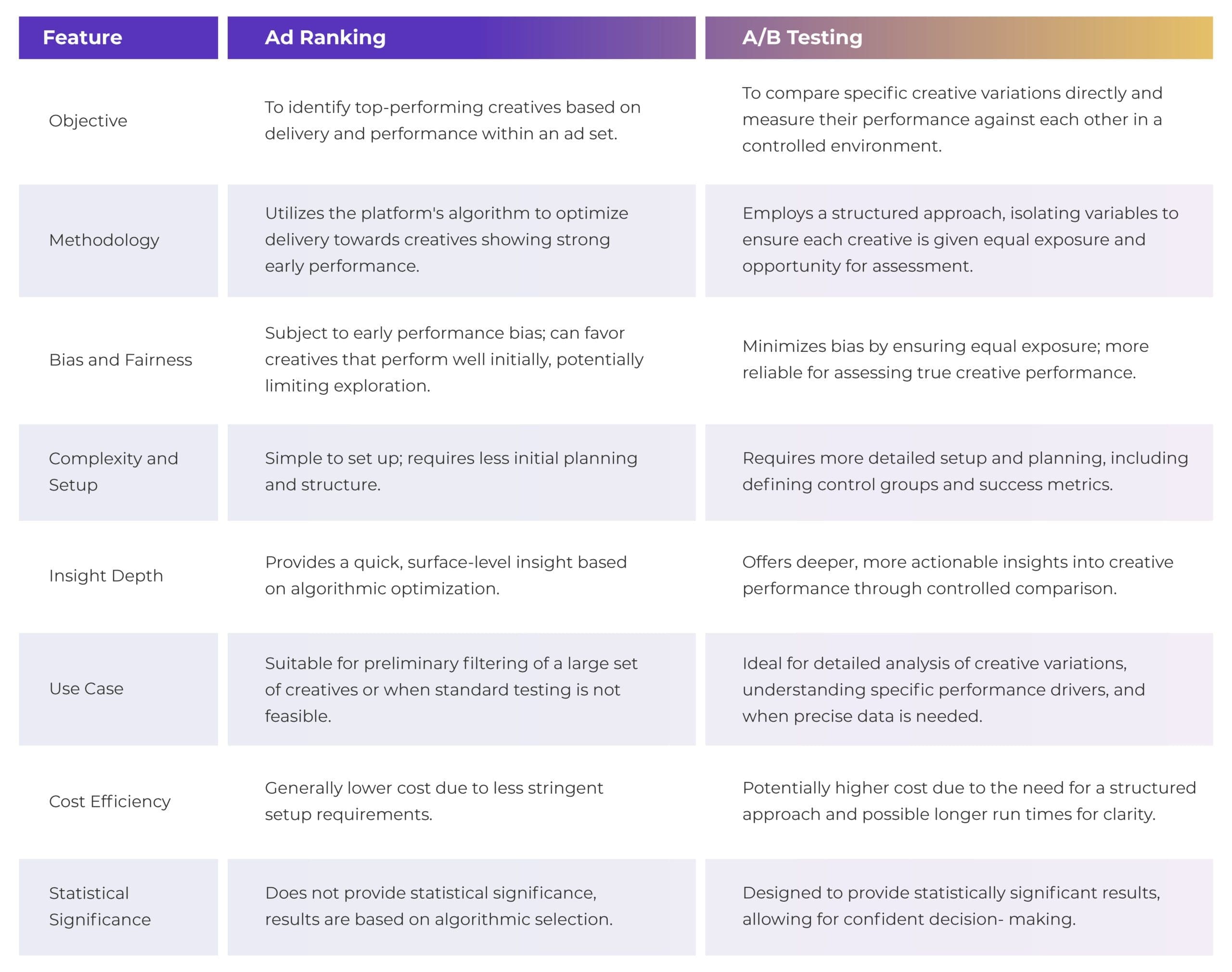
Even though it’s not as reliable as A/B testing because it’s prone to biases based on early performance, using ‘Ad Ranking’ within the Ads Manager can still give you quick insights, especially when running standard tests isn’t feasible for you.
This method takes advantage of Facebook’s auction algorithm, which naturally favors the best-performing creatives. But it’s important for you to remember that the “winning” creative identified this way might not actually be the best one overall. This is because not all creatives get an equal chance to show their potential.
What’s the difference between A/B testing and ad ranking (auction testing)?
What is performance bias and why is it important for you to consider when creative testing on Meta?
Performance bias, in the context of creative testing, particularly on platforms like Meta (Facebook, Instagram, etc.), refers to the tendency of an ad delivery system to favor certain creatives over others based on their early performance indicators. This bias can significantly impact the testing and optimization process for campaigns in several ways:
- Early winner selection: You might have experienced this already; when you launch several creatives in an ad set and only one (or two) of them get 95% of the budget allocated.
The ad delivery algorithm may quickly identify and favour creatives that show initial success in terms of engagement, click-through rates, or conversions. While this seems efficient, it can lead to a self-reinforcing loop where these “winning” creatives receive more exposure, further boosting their performance metrics in a manner that may not be entirely reflective of their overall effectiveness.
- Limited exploration of variants: When performance bias is at play, less initially successful creatives receive fewer impressions and less budget allocation. This reduced exposure means they are not given a fair chance to compete, which might prevent potentially effective creatives from being fully tested and optimized.
- Skewed data interpretation: Performance bias can lead to skewed data, where the success of certain creatives is amplified by their preferential treatment in the ad delivery system. This can mislead you into overvaluing certain designs or messages that appeared successful primarily due to their early performance rather than their inherent appeal to the target audience.
- Impact on creative diversity: A significant consequence of performance bias is the potential reduction in creative diversity. You might be less inclined to experiment with varied creative approaches if the ad delivery system seems to favour a narrow set of characteristics based on early performance metrics.
Therefore, to mitigate performance bias, you must have a structured and scientific approach to creative testing, including controlled A/B tests where each variant is given equal opportunity to prove its effectiveness.
This helps us ensure that decisions are based on comprehensive data. Allowing for the more accurate identification of high-performing creatives that resonate with the target audience.
Creative testing on Meta for iOS campaigns?
Due to iOS’ ad measurement limitations “You can create up to 18 iOS 14+ manual app promotion campaigns for each app or 9 Advantage+ app campaigns per country, language and optimization goal for each of the apps you promote” as well as the lack of ad level granularity due to SKAN – it’s recommended (from Meta) that you test your creatives on campaigns targeting your ads to people who have Android devices and people who use iOS devices running iOS 13.7 or earlier.
You can then apply the best-performing creatives to your iOS 14+ campaigns.
The budgets can make the difference in your testing
We’ve talked about the importance of A/B testing, ensuring fairness, and having a structured approach. Now, let’s dive into the practical steps you can take to start testing.
To estimate the cost of standard testing, use a straightforward formula: multiply the number of conversions you’re aiming for by the cost per conversion.
This calculation typically considers the last 7 days (L7D) and last 14 days (L14D) data for the specific KPI you’re focusing on optimizing. After determining the historical cost per result, your goal should be to achieve at least 50 conversions for each event over a 7-day period. Below, we’ll provide an example of how to set up a creative test structure effectively.
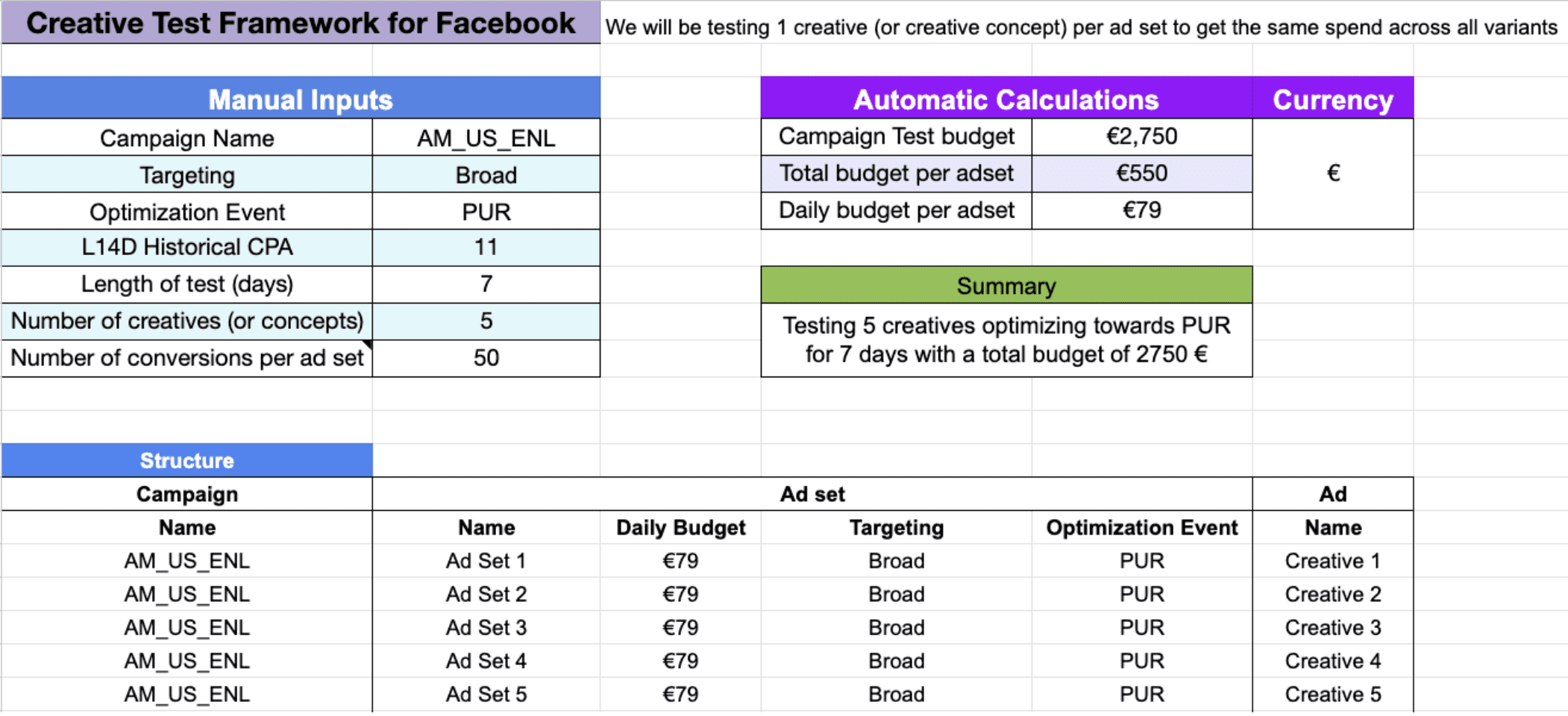
In this case, our cost per. purchase over the last 14 days (L14D) is €11, and we’re targeting 50 conversions to enhance the confidence and stability of the ad delivery. We then calculate the weekly budget by multiplying 50 by 11, resulting in €550.
To determine the daily budget for the ad sets, we divide our weekly budget by 7. This gives us a daily budget of €79 that we can allocate to our ad sets.
Aim for 50 conversions when setting up your test
Your tests need at least 50 conversions per week for each test group to meet the minimum stability requirements for campaign performance. However, our experience tells us it’s best to aim for more than 100 conversions per week per group. Remember, the more conversions you have, the more confidence you can have in the performance data you’re observing.
Below is a visualization of how the structure would look like.
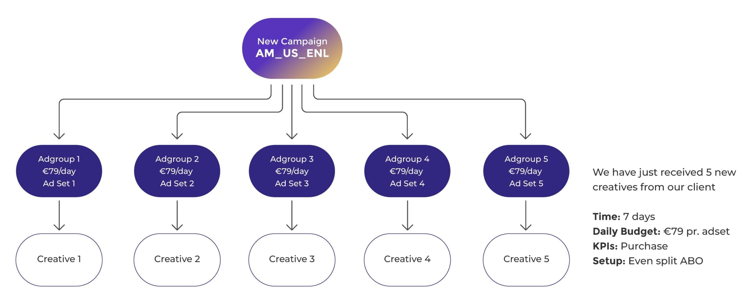
Bear in mind that the right approach will differ for each business.
Summing up creative testing on Meta
As you harness Meta’s tools for creative testing, remember that the goal is to make informed, data-driven decisions that elevate your campaign’s performance.
Whether you’re exploring new creative variations or optimizing existing ones, the essence of your success lies in applying these insights with clarity and precision.
Let this be your guide to creative testing on Meta, ensuring your creatives not only capture attention but also drive meaningful engagement. Should you need any assistance, our team is here to help – simply get in touch.
