What if I told you typography could be the key to your app’s market differentiation?
Table of Contents
In all the years that I’ve been working in digital advertising (over 14), I’ve learned that every scroll, swipe, and click is fought for. So, the questions that often came to my mind when trying to craft a visual message that wins that fight were:
- What’s the role of typography in advertising and mobile app marketing?
- Does it transcend mere text presentation?
Short answer: it does.
It becomes a strategic player in the quest for user engagement and brand differentiation. But to make sure I also explain why, let’s explore how the well-judged use of fonts not only enhances the aesthetic appeal but also significantly boosts the functional and emotional connection with mobile users
Art and Science of Fonts in UX/UI Design to boost user journey.
Typography within mobile app design blends the aesthetic appeal of visual design with the precision of human-computer interaction principles. This balance is critical in creating apps that are not just visually engaging but also highly functional and user-friendly.
UX/UI designers invest quite some analysis time in the typographic elements of mobile app design, demonstrating how these choices are far from superficial but deeply embedded in psychological and ergonomic principles. And though we are no experts in psychology, some authors highlighted a few key elements to this matter.
The Psychological Impact of Typeface Choices
Fonts carry inherent emotional weights and associations. For instance, sans-serif fonts like Roboto, Helvetica, or San Francisco are preferred in mobile environments for their clean, uncluttered appearance, which not only improves legibility on smaller screens but also evokes a sense of modernity and accessibility.
The psychology behind font size and spacing is equally significant. Larger font sizes and ample spacing are not just stylistic preferences but are based on the principle of cognitive load — the amount of mental effort required to process information. By optimizing these elements, designers can reduce cognitive strain, making information processing smoother and more effortless for the user.
Cognitive Ergonomics in Typography
The use of color in typography taps into cognitive ergonomics. Color can influence mood and attention, with contrasting colors used to draw the eye to critical information or actions. However, the choice of color goes beyond aesthetics, with considerations for color blindness and visual impairments guiding the design process to ensure inclusivity and accessibility.
Directing User Flow with Typography
Typography becomes a tool for directing attention and suggesting hierarchy. Varied font weights, sizes, and colors are used to create visual hierarchies that highlight essential features and pathways, making the app’s structure intuitive at a glance.
This strategic application of typography to direct user flow and decision-making is grounded in the principles of visual hierarchy and Gestalt psychology, which examines how people naturally organize visual elements into groups or unified wholes. By manipulating typographic elements, we can influence the user’s attention and the order in which information is processed, increasing conversion rates.
The Power of Fonts in Mobile App Advertising
Fonts are not merely vessels for words but powerful tools that can highlight features, convey personality, evoke emotions, and drive user engagement. As mobile apps continue to snowball, the role of typography in creating compelling digital advertisements will undoubtedly remain an essential consideration for brands looking to carve out their niche and connect with users in meaningful ways.
Crafting a Visual Identity
In performance marketing for mobile apps, the font choice can instantly communicate whether the app is fun and casual, sophisticated and professional, or bold and innovative. This immediate visual cue helps target the right audience and primes them for the experience that the app promises to deliver.
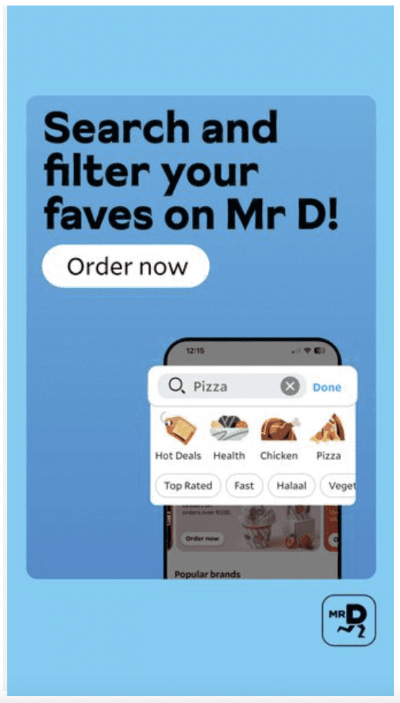
With a very straight forward message and clean, strong font, Mr. D explains their basic USP. Showcasing some App UI and on brand colors to introduce the user to the using experience of the app. Reflects an “easy going” personality, clear and expedite. Such as their service promises.
Enhancing Ad Clarity and Appeal
Fonts play a crucial role in ensuring that the key messages in your ads are not only legible but also enticing. A well-chosen font can make your ad copy pop, drawing the viewer’s attention to the benefits of your app and compelling call-to-actions (CTAs).

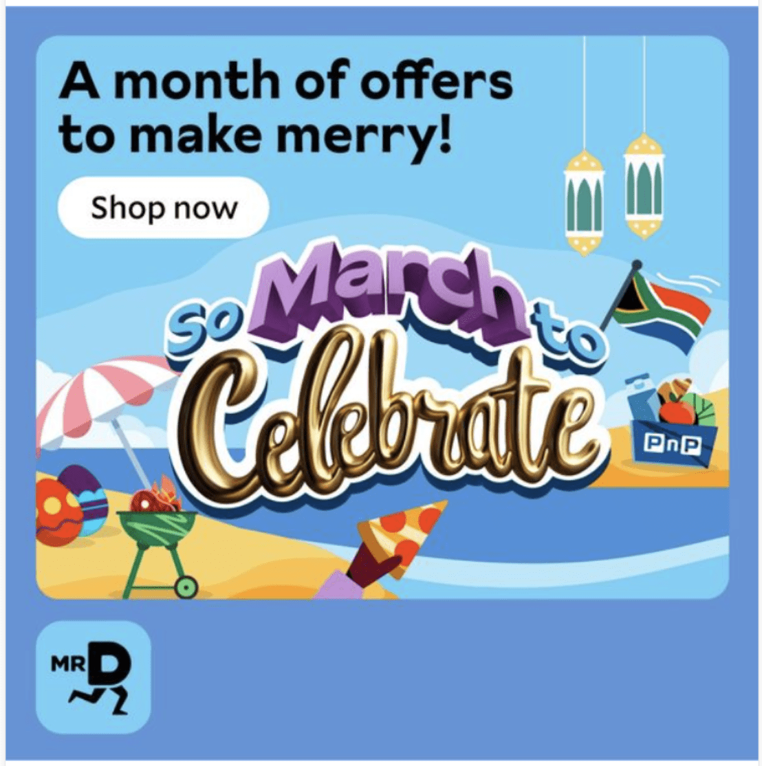
In this case, the message is a bit more poetic, targeting a specific audience behavioural treat. Nevertheless, the consistency on their typography and CTA combined with an visually appealing pic, makes the whole message faster to read.
Differentiating in a Crowded Marketplace
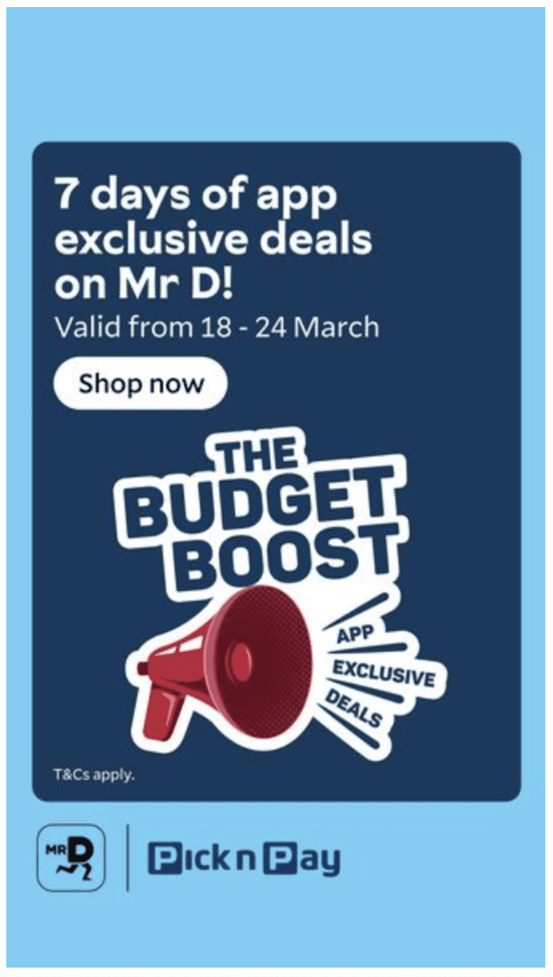
Using unique and memorable fonts can help differentiate your app from competitors within ad creatives. A distinctive typographic style can become a visual signature, enhancing brand recognition and recall. This consistency in fonts across your advertising campaigns solidifies your app’s identity in the minds of your target audience, making it more recognizable in a sea of generic ads.
Consistent use of on-brand fonts makes it easier for brands to present special offers to potential customers and for them to identify and relate these offers to our brand.
Driving Engagement Through Emotional Connection
Fonts have the remarkable ability to evoke emotions and set the mood. The emotional impact of typography in digital advertising cannot be underestimated. It can sway the viewer’s perception, making the ad feel more personal and relatable. For instance, a playful handwritten font can convey warmth and approachability, inviting engagement, while a sleek, minimalist font might evoke sophistication, appealing to a more premium audience. By aligning the emotional tone of the font with the app’s target user base, advertisers can foster a deeper connection and encourage more meaningful interactions with the ad.
The integration of typography in both app design and advertising underscores a brand’s identity, ensuring consistency across user touchpoints. This coherence is crucial for building brand recognition and loyalty, as it provides a familiar visual anchor for users across different platforms.
Consistent use of typography reinforces brand personality, whether it’s the sophistication of a luxury brand or the playful energy of a lifestyle app. Moreover, maintaining typographic consistency across app interfaces and marketing materials strengthens the brand narrative, enhancing the user’s association with and memory of the brand. This strategic alignment between app design and advertising typography not only amplifies brand presence but also fosters a stronger emotional connection with the target audience.
Closing Insights: The Future of Typography in Digital Branding
As tech keeps getting cooler and user demands for quick, digestible info soar, getting creative with fonts and text styles is becoming the next big thing. Brands that are game to try out the latest in typography, including cool stuff like AI-generated subtitles, aren’t just grabbing their audience’s attention; they’re setting themselves apart in the online world.
Bottom line, when it comes to marketing and mobile app ads, playing smart with typography does wonders. It’s all about making the user experience slicker, making your brand vibe stronger, and giving your ads that extra oomph. By designing kickass digital moments that hit right in the feels, brands can boost engagement and build a loyal fanbase, all while keeping up with the speedy pace of our digital lives.
If you are looking to grow your app through design and creative solutions, we have a team that can help you reach new records. Get in touch with us today!