Apple’s Custom Product Page is an entry point to more downloads. After Apple’s IOS 14 update, many marketers feared it was the end for customization. However, custom product pages are one of the few new weapons marketers can add to their arsenal in 2022. With high-impact designs, description text, and videos, app owners can harness this tool to get an edge over their competitors.
Table of Contents
What is it?
Apple’s new iOS 15 Custom Product Pages allow app developers to create custom content for their product pages in the App Store, specifically targeting segmented audiences. From uploading ever-important screenshots to video previews and promotional text, Apple’s custom product pages give you the chance to make an impression on potential customers.
Let’s say a user needs to purchase an upgrade for your app or pay for extra content; You can create a custom product page that allows them to make their purchase right on the page instead of taking them away from the app into the App Store, where they might lose interest before completing their purchase.
What does a Custom Product Page look like?
Custom Product pages can be built from current existing product pages, giving advertisers the opportunity to tweak certain elements for testing. Developers can also start a new page from scratch to experiment with more significant changes.
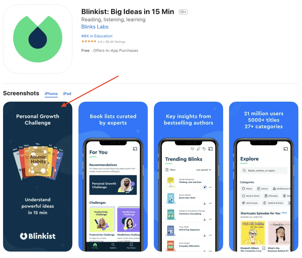
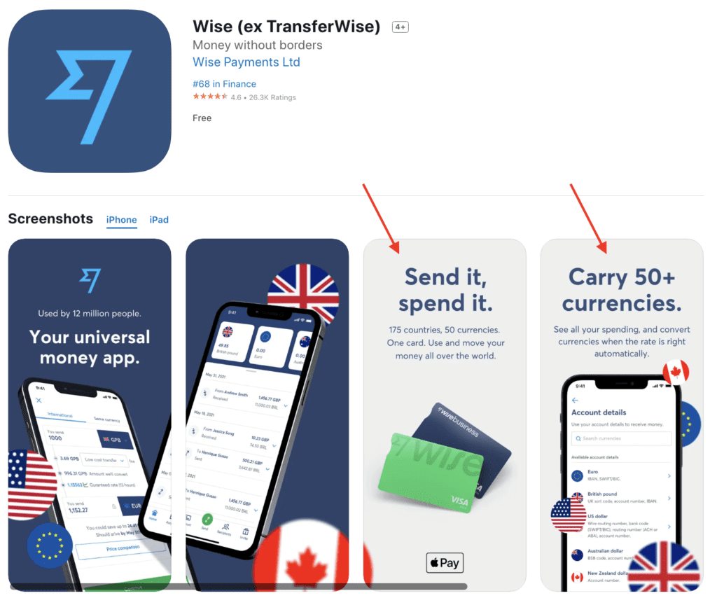
A Custom Product Page will be made up of screenshots, promotional text, and preview videos showcasing different elements of your app. You can create variants of your assets for each page and apply them to any of your page’s localizations.
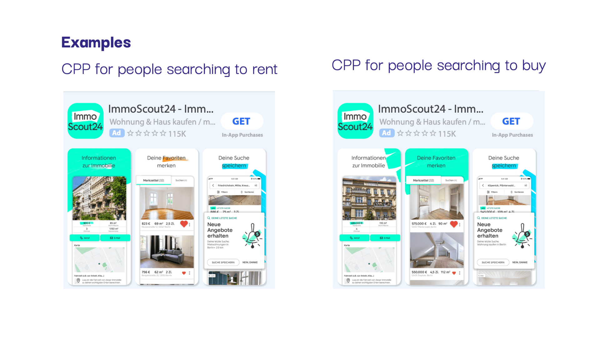
Here is an example from Admiral Media client ImmoScout24 – they use custom product pages to address different target groups – buyers and renters:  When your Custom Product Pages are ready to go, you can advertise them using the unique URL associated with your page on various marketing platforms.
This way you can target specific audiences based on where they see your ad. Users must follow the unique URL to access the associated page, as they will not see your Custom page in search results on the App Store.
Apple’s organic A/B testing solution, Product Page Optimization is a tool that advertisers can use to ensure custom pages are performing to the best of their ability.
How can apps use it?
App owners can publish up to 35 Custom Product Pages per App Store application. These variations enable app owners to:
- Emphasize specific functions with associated descriptions.
- Highlight your app promotions and updates.
- Have a unique store page URL. After you’ve created a Custom Product Page, it is accessible via a unique URL. And it is linked to specific acquisition campaigns on Apple Search Ads.
On top of these features, Apple also introduced its own split testing functionality with custom product pages. App owners can now compare various app icons, previews, and screenshots to determine which option is most appealing to target audiences.
At any given time, up to three versions of the product page can be tested against the default one. Using split testing, app developers can develop optimized, characters, features, promotional offers, and so on
You can determine the volume of traffic for each treatment. By using product page optimization, and keep track of your results in App Analytics via App Store Connect.
4 tips to use custom product pages
1. Use assets to highlight the benefits of your app
Custom product pages are a great way to educate users on how to use your app. But they can also be used as an opportunity to highlight all the wonderful things that make your app unique. Use clear and eye-catching graphic content that is both illustrative and persuasive. You should be able to persuade a consumer using simplistic and straightforward text and imagery that drives home why they need your app. Why not use this space as a way to show off some of the best features your app has to offer? 
2. Optimize your page treatment
Run A/B tests to determine which page treatment resonates with your customers and potential customers, within your custom product page. To test your page, try different app icons, screenshots, preview videos, and copy, so you know exactly what audiences find appealing. You can then create pages based on different locations, and audience types(up to 35) that you’re sure will have an impact.
3. Test Keyword Themes
Each ad group in Apple Search Ads focuses on a specific keyword theme or strategy. So you can experiment with different themes by creating custom product pages for each group.
4. Meticulously select your preview poster frame
The Preview Poster Frame contains a still from your App Preview Video. Once Apple has approved your App Preview, a default Poster Frame is chosen. However, you can use iTunes Connect to select a specific frame from the video that might be more effective. The Poster Frame is the first screenshot audiences will see, making it a make-or-break asset in some circumstances. It is essential to consider how this initial screenshot, along with your app icon will tell the story of your app. An ideal Poster Frame integrates with and supports your Icon and first screenshot by showcasing what your app is all about.

Conclusion
Apple’s custom product pages are closing the gap between ads and apps. With the ability to create up to 35 customizable product pages, marketers can integrate their advertising prowess into page development and optimize the user experience.


