Why you should improve your ASO from a visual perspective:
App Store Optimization (ASO) is a critical factor for an app’s success, and visual elements play a pivotal role in this. High-quality visuals enhance an app’s appearance and also significantly improve its conversion rate.
Table of Contents
“A picture is worth a thousand words,” and this holds especially true when users are scrolling through a multitude of apps. In this article, we’ll double down on the importance of optimizing visual elements, specifically focusing on designing App Store screenshots to boost downloads.
So, what can you improve visually?
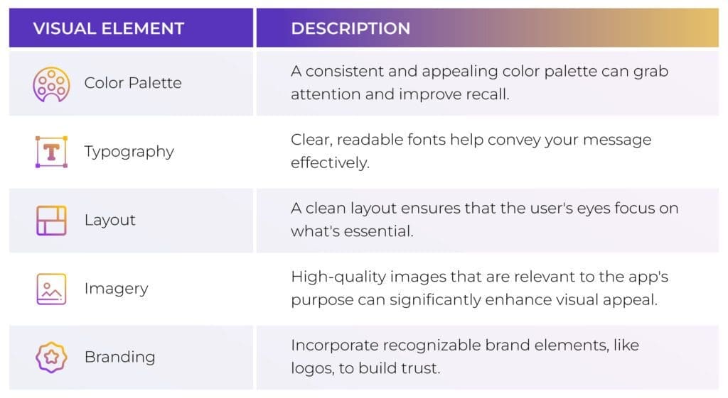
Before getting into the details of screenshot design, it’s essential to understand the broader visual elements that can make or break your app’s presentation in the store.
Take a look at the key visual components that require your attention and optimization. These elements work in harmony to create a compelling visual narrative for your app.
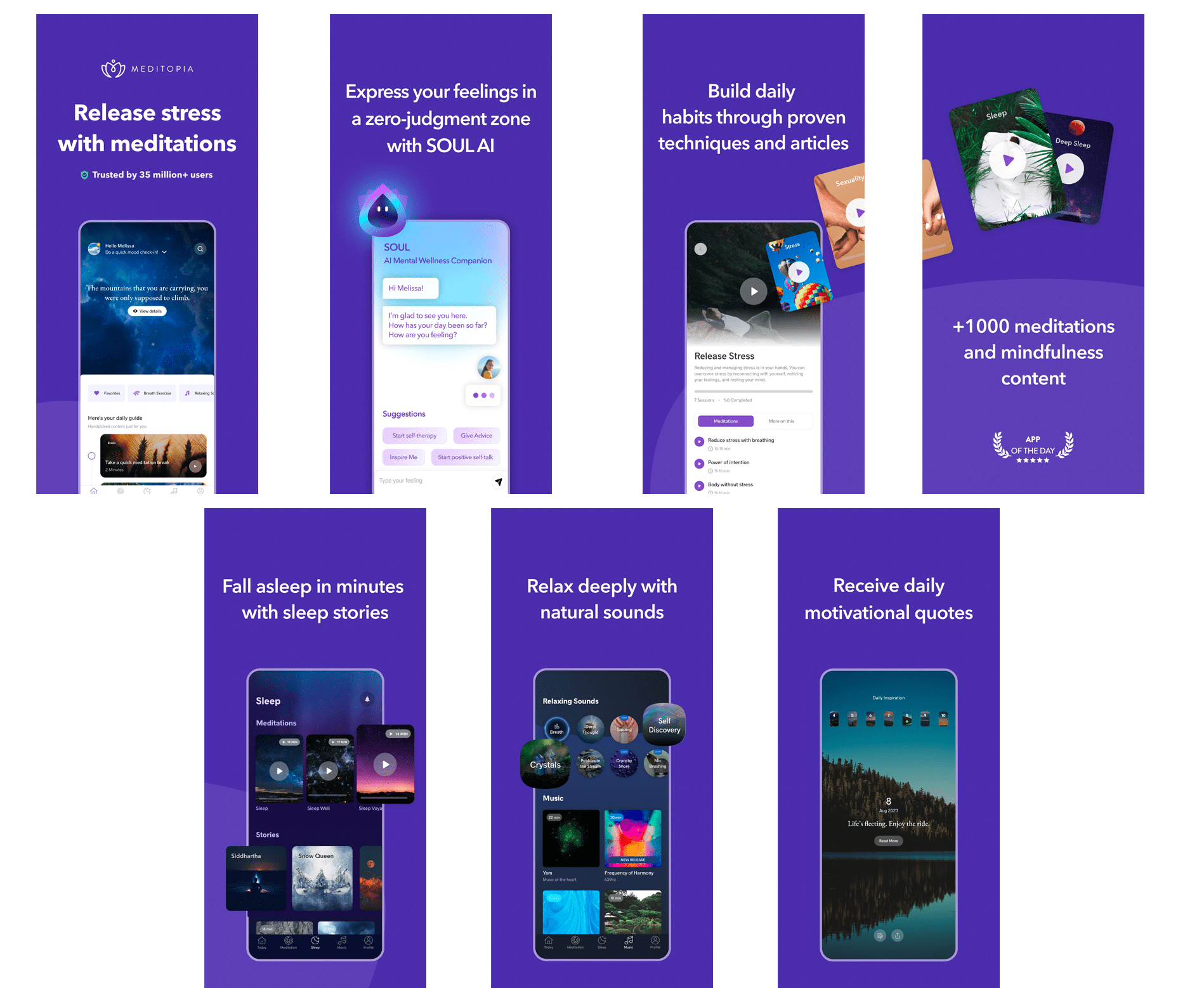
For example, Meditopia presents their icons and screenshots in the same color palette, grabbing attention because of the bright colors and contrasting white texts
Data: Apptweak
The example above illustrates a great example of how visual app store optimization could be done. Now why is it that great, you might think?
- Strong Branding: The consistent purple color scheme is attention-grabbing and memorable. This consistency helps in brand recognition.
- Clear Messaging: Each image conveys a benefit of the app succinctly, making it easy for users to understand what the app offers.
- Use of Mockups: Displaying the app interface within phone mockups gives potential users a clearer preview of the app’s design and functionality, setting the expectation for the user experience.
- Emotional Connection: The app’s features are presented in a way that connects with the user’s emotions — stress relief, relaxation, and motivation — which can be more persuasive than simply listing features. Think benefits before features.
- Social Proof: Highlighting that the app is trusted by millions adds credibility.
- Content Richness: By stating that there are “+1000 meditations and mindfulness content”, Meditopia demonstrates a wealth of resources available to the user, which can be a strong selling point.
- Simplicity: The design avoids clutter and focuses on one message per image, which aligns with the principles of good UX design for ease of understanding and decision-making.
From a psychological standpoint, these visuals leverage principles like familiarity, trust, clarity, and emotional connection, all of which are crucial for engaging users and encouraging them to download and use the app. Shall we dive a little further into how you can optimize your visuals?
The App Store Screenshot Blueprint
Understanding the structural elements of App Store screenshots can provide knowledge that helps you create more effective designs. Let’s break down the different components that make up a screenshot. From the number of screenshots, you can upload the importance of captions. This will serve as your blueprint for constructing visually compelling and informative screenshots.
- Number of screenshots: Both the Apple App Store and Google Play Store allow a limited number of screenshots (up to 10 for iOS and up to 8 for Android).
- Dimensions and aspect ratio: Every platform has specific size and aspect ratio requirements for screenshots depending on the app’s availability.
- Captions: Short text descriptions can accompany each screenshot to provide context.
- Core features: Your screenshots should highlight the app’s most essential and appealing features.
Our Best Practices for Your App Store Screenshots
Once you have a grasp of what to improve visually and the basic anatomy of an App Store screenshot, it’s crucial to follow some industry-accepted good practices. These aren’t just tips but methodologies to enhance visibility and conversion rates. Here are some valuable practices that can serve as your guidelines in the screenshot design process.
- Prioritize:
Keep the most impactful screenshots first, as not all users will scroll through all the screenshots. - Show Real-World Usage:
Use mockups that depict how the app looks on a device or include screenshots that showcase the app being used in real-world scenarios. - Localize:
If your app targets a global audience, localize the screenshots for different regions. - Test and Iterate:
Always A/B test your screenshots to figure out what resonates most with your audience.
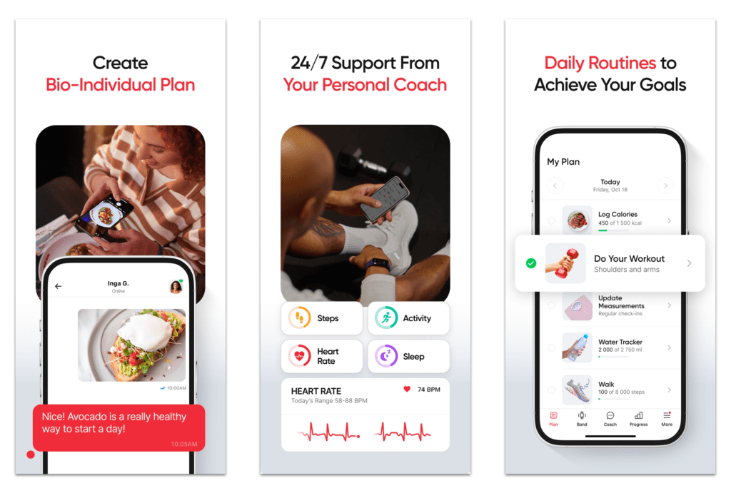
A great example of app store localization:
Here, I’d like to bring in an example of BetterMe’s English app store visuals:
And here’s an example of BetterMe’s Japanese app store visuals :
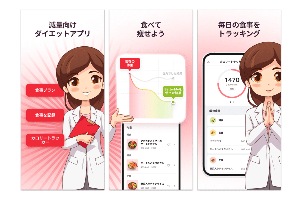
Here are three reasons why they’ve nailed their localization in Japanese:
Cultural Relevance: The use of a manga-style character shows they’ve tailored the visuals to fit the popular visual style familiar to Japanese users. This style is often used in Japan for a wide range of purposes and can make the app more engaging and relatable.
Language and Tone: The app uses the Japanese language, which is not only about translation but also likely incorporates the appropriate level of politeness and formality that is significant in Japanese communication. The language used seems conversational and friendly, which can make the app feel more personal and accessible.
Details: How the screenshots were adapted to the Japanese market:
-
- They translated the texts of the screenshots into the local language. Usually, this is the first step of screenshots localisation.
- Translated the app texts. This is usually difficult compared to the first step.
- Adapted characters – showed a manga-style character, the one common for the local market.
- Adapted food pictures to the local market – showing bowls and pictures, not photos of the food.
It seems BetterMe has understood how to nail their localization! There’s no doubt localization efforts can greatly enhance the user experience, by making the app feel more intuitive and culturally connected.
Step-By-Step Guide to Design Your App Store Screenshots
Creating appealing and effective screenshots is a multi-step process that requires thoughtful planning, design, and evaluation. This section provides a detailed, step-by-step guide to walk you through each phase of designing your App Store screenshots. From researching your audience to finally uploading the screenshots, we cover every aspect to ensure you’re well-equipped to create designs that can boost downloads.
Research Your Audience and Competitors
- Identify your target audience: Understand their needs, preferences, and pain points.
- Analyze competitors: Check your competitors’ screenshot designs for inspiration and differentiation and also for understanding what they serve the users.
Decide the Number and Sequence of Screenshots
- Prioritize your screenshots, keeping the most impactful ones first. Tests have shown that 6+ screenshots can increase your conversion rate, compared with the variant with a smaller number of assets.
Select the Right Dimensions and Aspect Ratio
- Use platform-specific size guidelines.
- Pay attention to the category chosen. Practice shows that horizontal screenshots can beat vertical ones in games.
An example of an app that uses vertical images, is Farm Heroes Saga.

An here’s an example of an app that uses horizontal images – Hay Day:

Use High-Quality Graphics in your App Store Screenshots
- Opt for high-resolution images for a better visual experience. But don’t forget that screenshots look rather small in the app store compared, to the designer’s display during the creation of the screenshot. Keep in mind that app screenshots have to catch the user’s attention among the competitors.
Focus on Core Features and Benefits
- Showcase the essential functionalities of your app.
- Tip: check the app analytics, what features are used by users mostly and show them on the first screenshots.
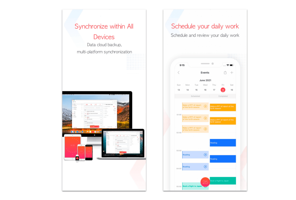
Include Real-World Usage
- Show the app being used in real-world scenarios if applicable.
- Reflect on how your app solves users’ problems or helps in their lives.
Here’s an example of an app that includes real-world usage Focus To-Do: Focus Timer&Tasks
Add Social Proof to your App Store Screenshots
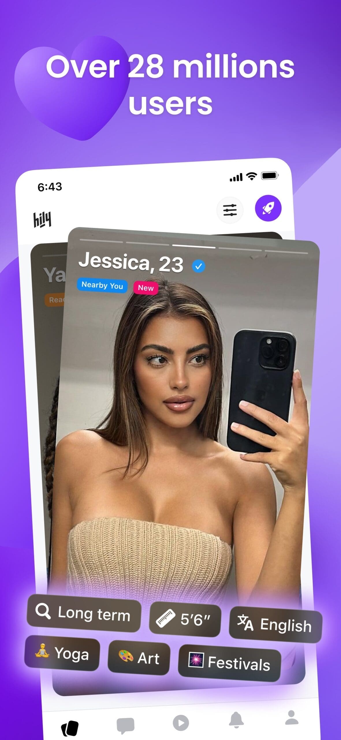
- Social proof serves as a powerful tool to validate your app’s quality and effectiveness from the perspective of real users. Positive feedback from satisfied users can significantly influence other potential users’ decision-making, as it offers authentic evidence of your app’s value.
Here’s some examples of apps that are using social proof, to increase credibility and trustworthiness, ultimately seeking to increase their conversion rate.
Period Tracker Period Calendar:
![]()

Hily Dating: Meet. Flirt. Date:
A/B Test Your App Store Screenshots
- Create a solid hypothesis.
- Create multiple versions for A/B testing to find the most effective design.
- To validate the results, always keep in mind which variables and how many of them you are testing.
Review and Upload
- Review the screenshots to ensure they meet all platform-specific guidelines.
- Upload to the App Store and Google Play Store.
- Tip: You can refresh the page and check the app store screenshots, one more time after downloading them to the store console. Our experience has shown that the screenshots order can mess up, so you need to put them in the right order manually.
Monitor and Update your ASO performance
- Keep track of performance and make updates as needed.
- Don’t forget about seasonality and possible updates, e.g. Christmas and New Year, summer – time of holidays, September – new school year begins, etc.
Glossary of ASO Key Terms
We know that jargon can often be a barrier. To make this guide more accessible, we’ve included a glossary of key terms you’ll encounter. This will help you better understand the terminology used in the realm of App Store Optimization (ASO) and screenshot design.
With these introductory paragraphs, the reader will have a clear expectation of what to find in each section, making the article more coherent and engaging.
- App Store Optimization (ASO): is a way to increase revenue by optimizing the app store page so the app improves its visibility and conversion rate. vi.
- Conversion Rate: The percentage of users who take a desired action, for example, download, subscription, or in-app purchase.
- Screenshot: A digital image capture of what appears on a device’s screen.
- Caption: A short text description accompanying a screenshot.
- Viewport: The visible area of a device screen.
- Aspect Ratio: The ratio of width to height of an image or screen.
- High-Resolution Images: Images with a large number of pixels.
- Mockup: A scale or full-size model of a design.
- A/B Testing: Comparing two or more versions in a real-life store page to determine which one performs better.
Conclusion
Designing compelling App Store screenshots is not just about aesthetics but also about effective communication and user engagement. Properly optimized screenshots can significantly boost your app’s downloads.
By understanding your audience, adhering to best practices, and continually testing, you can make your app stand out in an increasingly crowded marketplace. If you are looking for some eye-catching and conversion-oriented App Store Screenshots, don’t hesitate to get in touch with us, we sure can help on this one!


