





One icon test lifted conversion rate by 11.4% for Bible Companion
Turning store visitors into installs.
- conversion rate
- +11.4%
- confidence
- 97.5%
- Client
- Bible Companion, a Bible study app by Bickster
- Service
- App Store optimization (ASO)
- Test
- App Store icon A/B test, traffic split evenly
- Window
- Two weeks, June to July 2026
The challenge
Plenty of store visitors, too few installs
Most Bible apps hand you the text. Bible Companion helps you understand it, turning scripture reading into a habit users keep. The app already had strong store impressions, but too few visitors were downloading.
Visibility in place
Impressions were strong and interest in the category was clear.
More value to show
Visitors saw the listing but didn’t buy into what the app promised.
Untapped icon potential
The dark original icon carried reverence, but not the warmth of an app built for learning and self-reflection.

The approach
We started with the icon and tested it
Our hypothesis: a warmer, brighter icon would better reflect the app’s promise of understanding and self-reflection, and beat the darker original.
 +11.4% conversion rate
First impressions
The icon is the first thing a user notices about your app, so we started there.
A warmer variant
A luminous cross on a hillside, with a sunlit path suggesting hope and a personal journey.
A clean A/B test
Traffic was split evenly between both icons for 2 weeks, with conversion rate as the deciding metric.
The result
+11.4% conversion rate from one icon change in just 2 weeks
The same store traffic now turns into more installs, with the rest of the listing unchanged.
Improvement over the original icon
The tested icon’s conversion rate compared with the original’s, shown as the dashed baseline.
| When | Tested icon compared with the original |
|---|---|
| Start of the test, 21 June | Below the original icon |
| From 26 June | Above the original icon, with the lead growing |
| End of the test, 5 July | 11.4% above the original icon, at 97.5% confidence |
From the client
“The quality and knowledge of Admiral Media’s work are impressive.”
Try this in your app
Here’s your takeaway
Fix conversion before buying more traffic
If impressions are strong but installs lag, the store listing is the bottleneck, not reach.
Start with the icon
It’s the first thing users see in search, so it shapes every visit that follows.
Show the promise, not just the category
Test visuals that reflect what the app does for users, not only what it’s about.
FAQ
Questions about this test
Short answers on what changed, what moved and how to run the same test for your app. More on our approach on the App Store optimization service page.
What did Bible Companion change to lift its conversion rate?
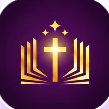
Only the app icon. The dark original, a gold cross over an open book, was tested against a warmer, brighter icon: a luminous cross on a hillside with a sunlit path. The rest of the store listing stayed the same.
How much did the conversion rate improve?
The tested icon lifted the store conversion rate by 11.4% compared with the original, at 97.5% confidence. Traffic was split evenly between both icons for 2 weeks.
Why did a warmer icon convert better?
Our hypothesis was that a warmer, brighter icon would better reflect the app’s promise of understanding and self-reflection. The dark original carried reverence, but not the warmth of an app built for learning. The test result is consistent with that hypothesis.
Why test the app icon first?
The icon is the first thing users see in search, so it shapes every visit that follows. When impressions are strong but installs lag, the store listing is the bottleneck, not reach, and the icon is the place to start.
Will an icon test work for my app?
If your listing gets strong impressions but installs lag, it is worth testing. Test visuals that reflect what your app does for users, not only what it’s about, and keep the rest of the listing the same so the result is clean.
How did Admiral Media run the Bible Companion icon test?
We started with the icon, because impressions were strong but too few visitors were downloading. We tested a warmer, brighter variant against the darker original, with traffic split evenly between both icons for 2 weeks, conversion rate as the deciding metric and the rest of the listing unchanged.
Your store listing next
Turn more store visitors into installs
Are store visitors leaving without installing? Talk to us about turning more of your store traffic into installs.
From App Store optimization and creative production to CRO and performance marketing, Admiral Media handles it all.
4.9 on Clutch from 48 reviews
Book a meeting
Takes about a minute. Fields marked with an asterisk (*) are required.